June 1, 2011 report
Study suggests 'hard to read' fonts may increase reading retention

(Medical Xpress) -- Researchers from Indiana University and Princeton, in a paper published in Cognition, describe two experiments they conducted that appear to show reading retention improves when fonts that are considered harder to read are used.
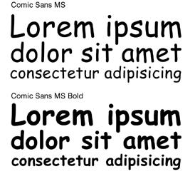
In the study, as described by lead author, Connor Diemand-Yauman in an interview with ABC Radio National, a first group of volunteers, comprised of 28 adults, were asked to read some fictional text and then were asked questions about the characters involved afterwards. The volunteers were divided into three groups, with each being given the same text but printed in a different font; the first got 16-point Arial, the second 12-point Comic Sans MS and the third 12-point Bodoni MT. The group that had the so-called hard to read Comic Sans outperformed the other two on the questions given afterwards.
In the second study, the volunteers were high school students (over 220 of them, from six separate groups) reading normal course material in different fonts; some of which were considered hard to read, such as Comic Sans or Monotype Corsiva. Once again, those that were reading the material printed in the more difficult to read fonts outperformed those reading easier type on tests given afterwards.
Diemand-Yauman says these experiments show that people tend to remember what they’ve read better if the material given is in a hard to read font.
What’s not discussed in the paper, however, is if it was possible that the results achieved were due simply to the newness of the fonts to the readers, thus heightening their awareness, or what criteria was chosen in deciding which fonts should be considered as “hard to read.” Many fans of Comic Sans, for example might argue that it’s actually easier to read than say Arial, or Callibri, both of which are considered easy to read by most in the mainstream.
Also, if what the study suggests is true, might it be possible to integrate such fonts as Comic Sans into textbooks, or journals (or on the web) to help improve retention, and hopefully overall learning, or would such hard to read fonts cause excessive eyestrain and headaches?
In either case, it’s clear that this research has opened the door to a new area of learning science that will no-doubt lead to more studies which will hopefully clear up such questions and in the end provide us all with the best font for whatever we might be reading.
More information: Fortune favors the bold (and the Italicized): Effects of disfluency on educational outcomes, Cognition, doi:10.1016/j.cognition.2010.09.012
Abstract
Previous research has shown that disfluency – the subjective experience of difficulty associated with cognitive operations – leads to deeper processing. Two studies explore the extent to which this deeper processing engendered by disfluency interventions can lead to improved memory performance. Study 1 found that information in hard-to-read fonts was better remembered than easier to read information in a controlled laboratory setting. Study 2 extended this finding to high school classrooms. The results suggest that superficial changes to learning materials could yield significant improvements in educational outcomes.
© 2010 PhysOrg.com


